For Super Sleuth DC Fans: An ongoing look at 86 years of DC Comics, beginning with New Fun #1, January 11, 1935 through March 1938.
Contributor mini bios: Charles Flanders, Walt Kelly, Charles Shows, Rosemary Volk, Ray Wardell
Major Malcolm Wheeler-Nicholson continued publishing comics throughout 1936 under two company names—More Fun Inc. and National Allied Newspaper Syndicate Inc. and there would be a third company added before the year was out. Keeping track of the various companies and the names of the magazines—New Fun, More Fun, New Comics, which would eventually become Adventure Comics is difficult for scholars and collectors and even more so for fans. This is an example of the Major moving all the various components including financing of the nascent comic book industry on his visionary chess board.
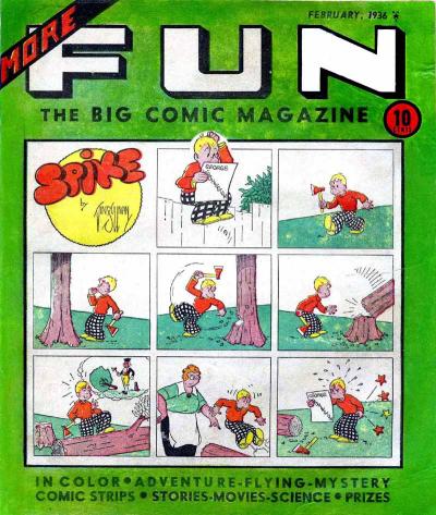
More Fun #8 appeared on newsstands January 10, 1936 with a February cover date. “More” appears diagonally across the left-hand side and underneath “FUN” is “The Big Comic Magazine.” The SM logo is in the upper righthand corner indicating they are continuing to distribute. The cover, in color with a green background, featured a signed Vin Sullivan 3 strip comic, “Spike,” without word balloons. Spike reads about George Washington and decides to chop down a rather large tree which is not appreciated by his mother. More Fun’s covers remain as full-page comics unlike New Comics featuring one image on the cover. “In Color, Adventure, Flying, Mystery, Comic Strips, Stories, Movies, Science and Prizes” appears at the bottom in bold.
The masthead on the inside cover is the same as More Fun #7 and New Comics #1 (December 1935) and #2 (January 1936) with Malcolm Wheeler-Nicholson, Editor and Publisher; William H. Cook, Managing Editor; Vincent A. Sullivan, Assistant Editor; and John F. Mahon; Business Manager.
© 1935 National Allied Newspaper Syndicate, Inc. In Great Britain all rights reserved appears on every page.
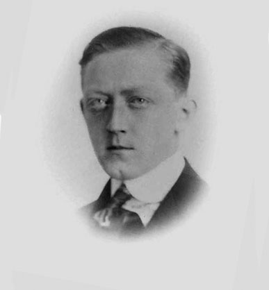
William J. Delaney from David Saunders Pulp Artists
The indicia is the same as More Fun #7 (January 1936) with one notable addition. “For advertising rates address William J. Delaney Inc., Eastern representative, Graybar Bldg., 420 Lexington Ave., New York, N. Y…” Delaney was a powerful executive in the pulp and advertising world having ties to William Randolph Hearst among others. Delaney taking over the advertising indicates he saw potential for the new comics magazines. Although there are not many ads in the magazine, according to David Saunders the practice at the time was that the same ad would appear in all pulp magazines the same month. “Thus, while one pulp might only have a circulation of something like fifty thousand (hardly an impressive figure for the advertiser’s purposes), the total circulation for the group of magazines might be a million or more.” It seems logical that Delaney was adding in the Major’s comics magazines to his pulp advertising accounts.
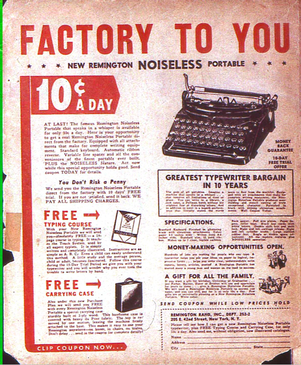
The back cover full page ad in black and white for Remington typewriters is probably an example for that advertising practice. The inside cover features a ¼ page ad for Pastime Novelty Company, a continuing advertiser and a ½ page ad for The Crowell Publishing Co., recruiting boys to sell magazines. The Thomas Y. Crowell Company would later publish the Major’s book, Are We Winning the Hard Way in 1943. There is a small ¼ column ad for Max Miehl, coin dealer appearing on the “Stamps and Coins” page and a small ad difficult to read from my digital copy that appears to be for the Wilson Chess Company. A. G. Steen’s House of Magic has a ¾ column ad on the “More Fun and Magic” page.
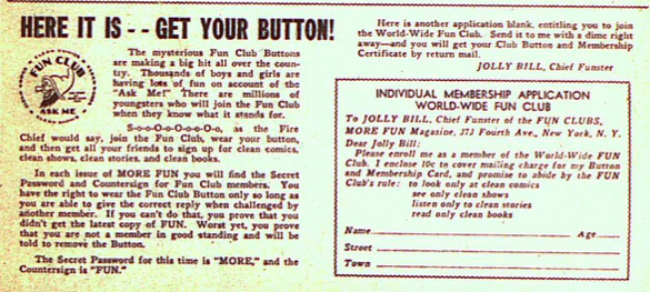
There are several ads throughout the magazine promoting More Fun and New Comics as well as the promotional ongoing contest. Here it is – Get Your Button! takes up the bottom of one page encouraging readers to join the World Wide Fun Club for a dime. Loederer’s Fun gnome continues being used in the branding.
A Special Holiday Premium Offer is a large ad for a subscription to “Fun Magazine” …”and as a special inducement, we will present to you free of charge, with our compliments a Special Surprise Gift Package of Playthings and fascinating novelties.” Since this appeared on newsstands January 10th, the offer is a little late for the holiday season and may indicate some timing issues.
Universal Toy & Novelty Mfg. Co. has a tie-in promotional ad with More Fun offering a “Fun Surprise Package” of toys and novelties for a dime plus 5c for postage. Dick Loederer’s Fun gnome is on the ad. Was there a connection?
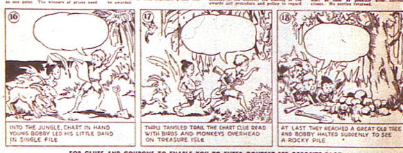
The big promotional piece is the “Join the Treasure Hunt Contest” which takes a full page and a coupon to send in at the bottom of another page. Dick Loederer’s original illustrations are still in use. W.C. Brigham drew the cartoons with blank balloons for the kids to fill in. Each cartoon has clues for what the character would say. Kids have to send in the cartoon, the coupon and a dime for cash prizes up to $280 and a camera. Honestly, I’ve read this contest a number of times and I’m still not sure I quite understand it.
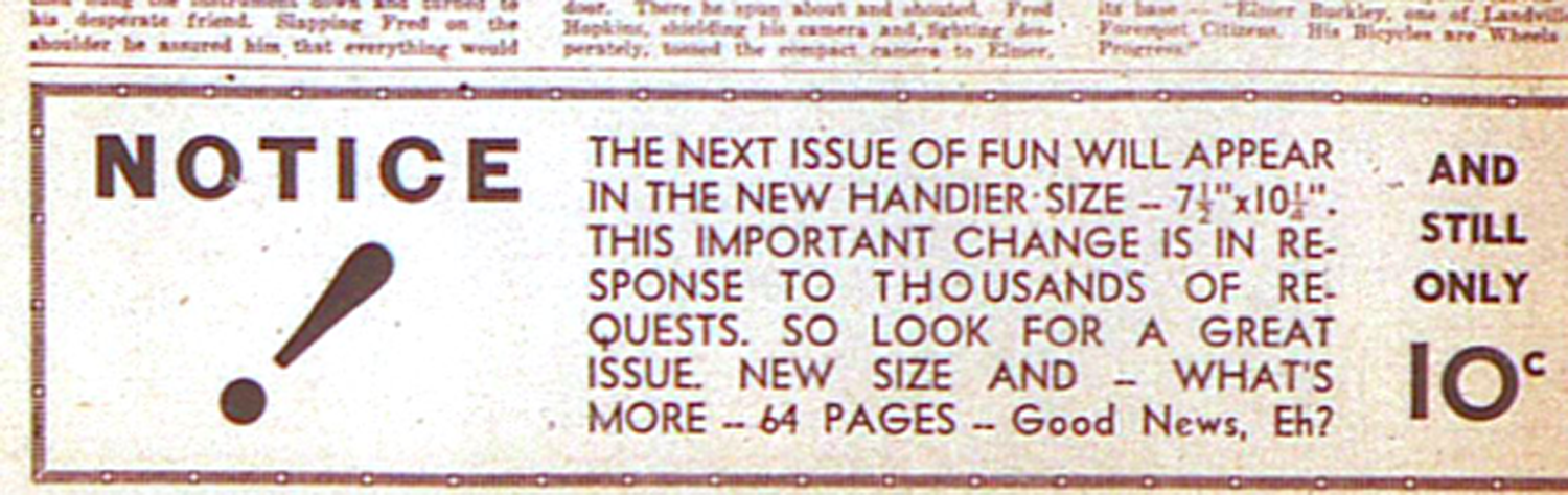
A small ad at the end of the radio news page promotes the next issue of “Fun.” “The next issue of FUN will be bigger. There’ll be 64 pages. Watch out for the new cover. A great issue! Remember the new size: 7 ½ inch by 10 ¼ and 64 pages. And only the Dime!” A larger ad at the bottom of one page announces the same information. This is historically worth noting as it heralds the new size that is coming for More Fun #9 at 7 ½” by 10 ¼”. This became the standard for comic book sizes that is still in use today. According to the ad “This important change is in response to thousands of requests.” The “MWN Irregulars” take on that is that Famous Funnies (mostly reprints of newspaper strips) was appearing in that size and other comics followed.
The inside back cover is a full-page image of the cover of the January issue of New Comics #2 in color featuring the Robert G. Leffingwell illustration.
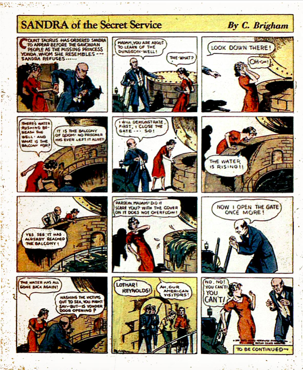
“Sandra of the Secret Service” by C. Brigham (William Clarence Brigham, Jr.) in color continues to occupy prime real estate as the first page of the comic. The script is most likely the Major’s. Count Taurus attempts to persuade Sandra to appear before the Gavonian people as Princess Yolanda. She refuses and the Count threatens her with drowning in the dungeon. Sandra’s hair is slightly blonder and she remains in the ubiquitous red dress that most female characters wore during that period when drawn by men.
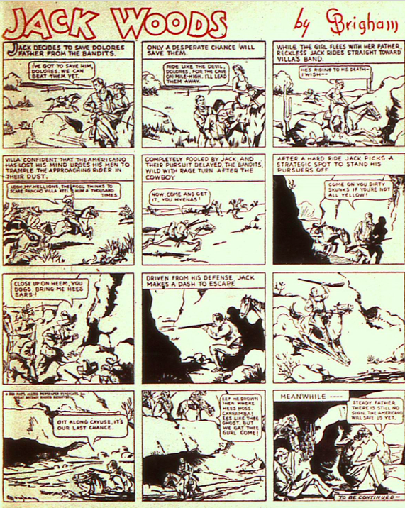
Brigham has two additional comics in the magazine. “Jack Woods” by “Brigham” in black and white, the ongoing story from New Fun #1, (January 1935) finds Jack rescuing Delores’s father. They gallop off on horseback while Jack attempts to distract Pancho Villa by riding straight at Villa and his men. He leads Villa away from Delores and goes into a river, which I presume is the Rio Grande, in order to escape. Meanwhile Delores and her father are hiding in a cave waiting for Jack. I couldn’t help but notice that Delores looks exactly like Sandra of the Secret Service.
“Brad Hardy” by Brig (William Clarence Brigham, Jr.) is an orphan that needs a home. It began in New Fun #3 (April 1935) with a Dick Loederer byline most likely from an idea of the Major’s. It was taken over in New Fun #6 (October 1935) by Brigham and has gone steadily downhill. There is no real motive for the action nor a driving story line and the artwork isn’t all that intriguing. It’s clear Brigham’s heart is not in it.
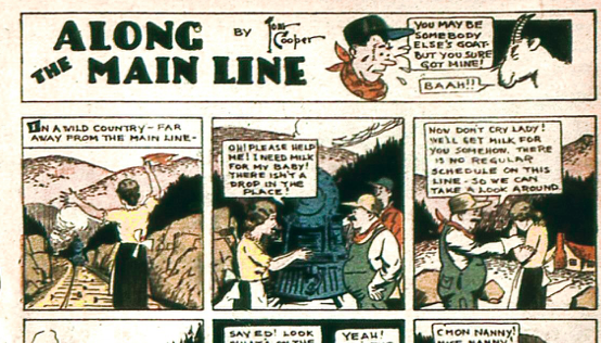
Tom Cooper has his usual abundant output in More Fun #8 with 4 comics—either continuing characters and/or continuing stories. “Along the Main Line” in color, featuring the train engineer Ed and the stoker, Jake, has a new story that is simple and we trust, aimed at children. A woman waves them down and tells them she has no milk for her baby. They agree to help and luckily find a goat on the tracks who chases Jake back to the woman. The artwork is detailed but not fussy and the characters well drawn.
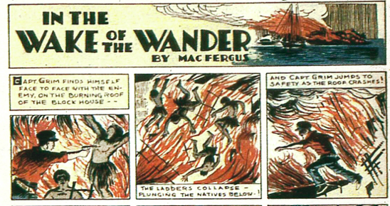
“In The Wake of the Wanderer” in color by Mac Fergus (Tom Cooper) continues the story of Captain Grim. The natives and the captain are on the roof of the blockhouse which catches fire. The natives fall and the captain is trapped. The last panel ends in a cliffhanger with the captain attempting to jump. Cooper’s artwork is versatile and doesn’t have the same cartoon lines as his other comics. This strip is more illustrative similar to the pulps he illustrated.
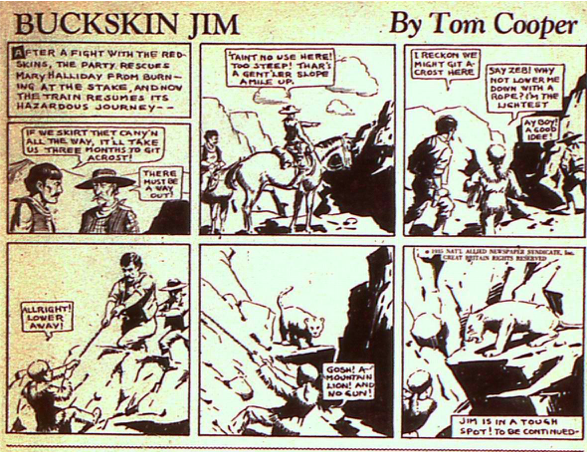
“Buckskin Jim” by Tom Cooper in black and white picks up the further adventures of Jim rescuing Mary Halliday from the “redskins,” a term that was used pejoratively for native peoples but unfortunately is not unusual even today. The wagon train attempts to head out of the canyon and Jim is lowered on a rope to explore the way out. In the last panel, a literal cliffhanger, he is confronted with a mountain lion.
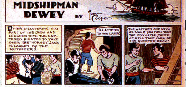
“Midshipman Dewey” in color by Tom Cooper continues the story of Jack, our young hero. He is caught by the mutineers who are in league with the captured pirates. They leave him tied up and begin to take over the ship. The pilot is knocked out and the last panel reveals the leader of the mutineers vowing to take care of the Captain next. The artwork looks like a combination of cartoon style with classic illustrative style. The story isn’t all that interesting but may be because it wasn’t Cooper’s creation. The story began in New Fun #2 with an Adolphe Barreaux byline and continued by him in New Fun #3. Richard Loederer as RAL picked It up in New Fun #4 and continued it for New Fun #5 and #6. Tom Cooper’s byline began with More Fun #7. Is this one more of the Major’s ideas thrown out there for others to execute? Or did Barreaux not have all that much interest and let it remain with the magazines?
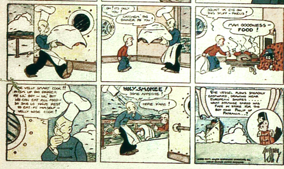
Vincent Sullivan not only had the cover and was assistant editor but he had two comics and a fictional story in More Fun #8. “Spike Spaulding” in color by Vincent Sullivan continues the ongoing story of Spike being kidnapped and on board a ship, in which his black friend Pincus is also on board as a stowaway. The storyline is intriguing but again and unfortunately both Pincus and the Chinese cook are depicted in the artwork and dialogue as racial stereotypes.
“Charley Fish,” a continuing character by Vin Sullivan is featured in a complete story. It’s a simple storyline with Charley getting laryngitis and his “servant” deciding that if he jabs him with a sharp object Charley will get his voice back. The servant is a black man drawn in a cringing racist stereotypical fashion even worse than Pincus and speaks in the usual derogatory manner. He refers to Charley as “boss.” It might have been amusing otherwise.
“Henri Duval,” by Jerome Siegel and Joe Shuster is now in color for this issue. The story is told more concisely than in the previous episodes and Joe Shuster’s artwork continues to evolve. Duval has saved the King’s men from assassins and it appears that the King’s men have arrived but the King says they are imposters. The last panel with Duval looking down from the rooftop is especially dramatic and alive.
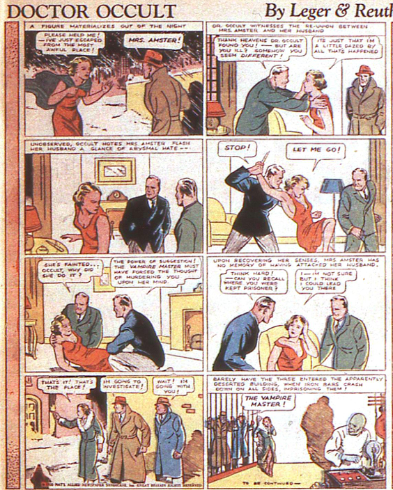
Siegel and Shuster’s second contribution under pseudonyms is “Doctor Occult” by Leger & Reuths, also now in color. The story continues with Dr. Occult standing on the corner when Mrs. Amster runs to him for help. Dr. Occult takes her home to her husband. She attempts to kill her husband and Dr. Occult stops her. She wakes up not realizing what she has done having been hypnotized. She leads Dr. Occult and her husband to the place she was kept. When they enter, the vampire master captures them. The story and artwork remind me of some of the early German Expressionist films. The story by Jerry Siegel is compelling and Joe Shuster’s artwork is evolving in a terrific style. There are lots of details but it is clean and clear with plenty of space in each panel so it’s easy to see what is going on. Mrs. Amster wears the ubiquitous red dress.
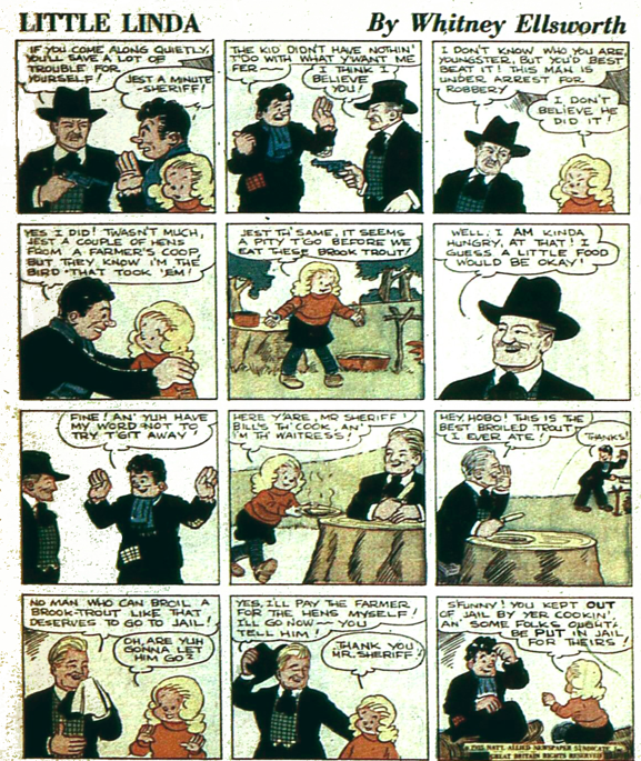
“Little Linda” in color by Whitney Ellsworth resumes the story of the orphan Little Linda, a sort of “knock-off” Orphan Annie. In this Depression era-story the sheriff arrests the hobo for stealing chickens, to which he admits. Linda suggests the sheriff eat the fish they have caught. The hobo is such a good cook that the sheriff decides to pay for the chickens himself. Ellsworth’s artwork is good but not especially striking. However, the story is compelling and Ellsworth clearly learned a thing or two about story by the time he was producing and writing for the Superman tv series.
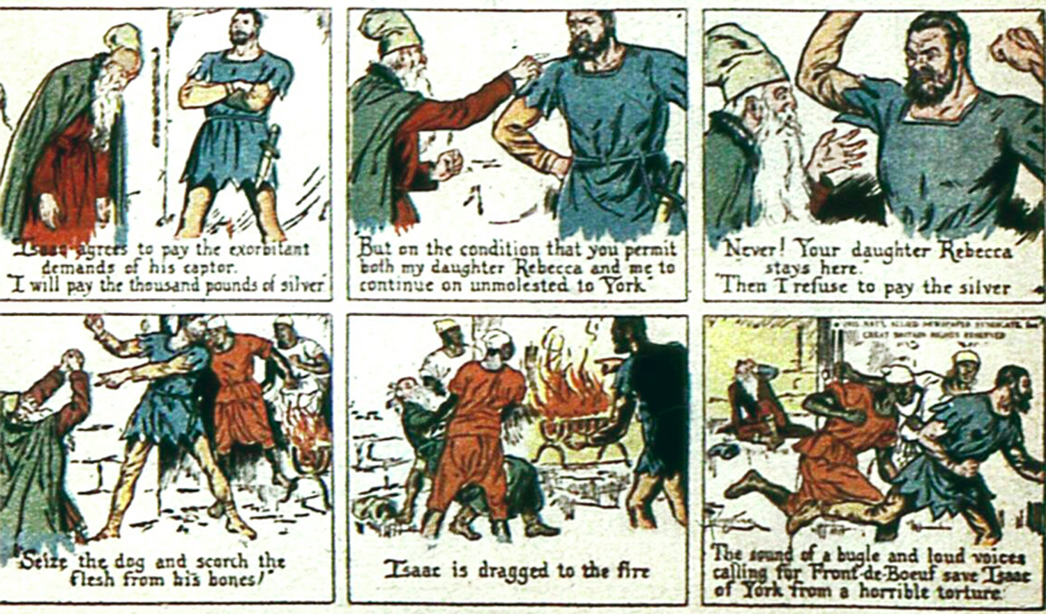
Two classics comics are depicted in More Fun #8. The ongoing story of “Ivanhoe” in color from the Sir Walter Scott novel is from a script by the Major most likely. I’m working from a digital copy that is somewhat blurry and there appears to be a signature in the last panel. It looks to be that of Livingstone although the Grand Comics Database lists Raymond Perry as the artist. The same signature also appears in the last panel of The Motherlode story. I did some further research and you’ll note the conclusion in The Motherlode story further down. Font de Boeuf demands silver from Isaac who asks for his daughter’s release but is denied. The story is told at the bottom of the panels with some dialogue.
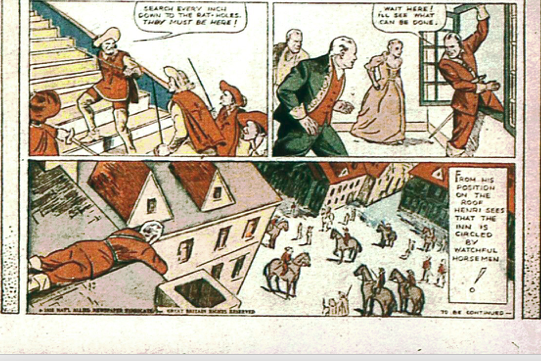
“Treasure Island” by Robert Louis Stevenson is in color with a script most likely by MWN. It is also a continuing story and made its debut in New Fun #5 illustrated by Charles Flanders who continued to illustrate it through More Fun #7. There is no byline or signature for the story in More Fun #8 but it is attributed to Sven Elven. If so, this is his first contribution to the magazines. The artwork doesn’t appear to be that of Flanders and he usually had a signature even if it was simply his initials CF. The story is told in the classic style at the bottom of each panel with no balloons. The inn is destroyed but Jim has the packet which they take to Doctor Livesay. He opens it and they discover the treasure map and decide to outfit a ship to go after the treasure. The story is a little stilted but the artwork is good.
Charles Flanders, one of the original New Fun artists illustrated “Sandra of the Secret Service,” “Ivanhoe” and “Spook Ranch” for New Funs 1-3. He illustrated “Treasure Island” for New Funs 5 and 6 and More Fun 7. I suspect he was already doing other work after New Fun #3 but had completed the Treasure Island series earlier. As I stated in the DC Famous First Edition New Fun #1 (2020) although Flanders has been credited as the creator for “Sandra of the Secret Service” he was not a writer. He created only one character throughout his long career, Robin Hood, already a known fictional character, for King Features. Flanders was born in Buffalo, NY in 1907 and studied at the Albright Art School there while working for a silkscreen company. Moving to New York City in 1928 he began working for MacFadden Magazines as an art director, a publisher of pulps among other magazines. Beginning in 1930, he worked on strips for King Features in 1930 including “Bringing up Father.” Other than his work for New Fun the rest of his career was with King Features. He began drawing “The Lone Ranger” in 1939 and continued doing so until 1971. Flanders died in Spain in 1973.
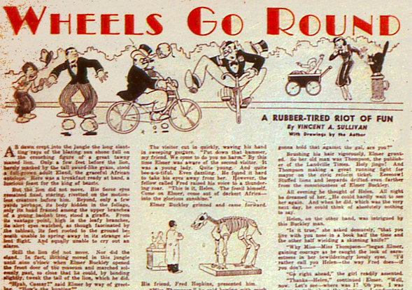
The prose story needed for second class postal rates is “Wheels Go Round, A Rubber-tired Riot of Fun” by Vincent Sullivan with drawings by the author. The title is in red in a panel across the top of the page including drawings. It’s a goofy tale about our hero Elmer infatuated with Helen whose father is running for mayor. It continues for several pages throughout the magazine. Elmer inherits a bicycle factory and cannot sell it. His friend Fred is fired from the newspaper. Fred has a photo of the current Mayor and councilmen revealing their cabal and nefarious plots. Elmer takes the photo around to the councilmen and they all start riding bicycles. Nothing like starting your business with a little blackmail. The Mayor orders a hit on Elmer but conveniently Fred’s girlfriend Dixie is a singer at the club where the conversation takes place and tells Elmer. Dixie is kidnapped by the gangster Johnny Rigalli and Elmer and Fred go to her rescue. They find her at the old “Ellsworth” mansion. Note the inside joke. They burst in, take photos of the gangsters and Mayor Caldwell and manage to rescue Dixie and escape. They ride their bikes, outwitting the gangsters, who are following in their car and arrive at the newspaper office with their exclusive. It’s a pretty far-fetched story but fun. It would have been much better as a comic.
The MWN Group weighed in on my question regarding the specifics of the need for prose in order to have second class mailing rates. Lionel English found an excellent source for that question and it goes back to the Constitutional establishment of the post office and further rulings over the years that established the practice but as far as anyone can tell there was no specificity about the number of pages. Bob Hughes believes that the Major used more text than other comics to make the magazine look classier. I would tend to agree that is one of the reasons.
A second prose story appears on the page labeled “Junior Funsters” obviously aimed for younger children. “The Happy Hour Club … A short story by Rosemary Volk.” There is a small illustration most likely by Volk as well. A club is started by a group of young girls. They decide to give Dinah the job of Vice President because she is slow and fat and Vice Presidents never do anything anyway. They need to raise money and Dinah suggests they rent out their clubhouse to the boys, the Tigercats. Everyone thinks this is a great idea and Dinah goes home to have her brother agree. She returns the next morning and informs the group that her brother has been elected President of the Tigercats and if Dinah isn’t President the Tigercats won’t rent the clubhouse. Of course, they elect her. I’m not sure what the moral of the story is here since the description of Dinah is not too positive and the way she achieves becoming president isn’t exactly fair play.
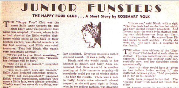
Rosemary Volk is a mystery. So far, I haven’t been able to find anything about her in the usual databases. Carol Tilley mentions Volk in Tilley’s excellent article “Superman Says, ‘Read!’” National Comics and Reading Promotion.” Other than Volk’s work in the Major’s magazines there is no other information as yet. All we know is that she contributed to New Comics #2 (January 1936) and More Fun #8 and that is apparently the last time she appeared in the magazines. For New Comics #2 Volk had a short story, contributed the content for “It’s a Dern Lie” and as Tilley writes about “The Book Shelf” feature, “Volk seemed poised to write more columns, as she encouraged young people to write her if they needed help “with [their] book problems.” In addition, Volk was given more space for that article than was previous. There were illustrations accompanying her pieces that I’m assuming are hers. She may have written the “Books Books” article in More Fun #8. Given the Major’s explanation that they were normally working three months ahead, I’m guessing she would have been contributing more or less around October 1935 through about the end of January 1936. I’ll keep looking.
There are several recurring feature articles. “Movies,” has no byline. A photo of Rudy Vallee and his dog Wendy, “a fine Doberman Pincher” is at the top of the page but he isn’t mentioned until the very last paragraph in the section about radio shows. The latest movies are discussed including Captains Courageous, Captain Blood and Fang and Claw. The radio section isn’t labeled and is about 1/3 of a single column unlike the earlier New Funs. A column with no logo on the “Books Books” page features a photo of Freddie Bartholomew, a child actor recently hired to play David Copperfield in an upcoming film.
“Stamps and Coins” has a slightly altered logo from the Dick Loederer illustration and no longer carries his initials and there is no byline. The full-page article contains information about charity stamps and half-dollars.
“More Fun and Magic by the Wizard of Biff” another recurring full-page feature that began in New Fun #4 (May 1935) continues the signed Loederer illustration. There are the usual magic tricks explained in detail for readers to practice on their own. There is also a small illustration by “Bill” Cook that has nothing to do with the article and was obviously filler.
“Books Books” continues with the Loederer illustration as well and there is a small illustration that may have a signature. The article is unsigned. It’s always interesting to read the reviews of books aimed for children during that era. One review that particularly struck me given the racist stereotyping of Chinese people in some of the comics is a review of River Children by Mary Brewster Hollister, a tale of three orphan Chinese children and their adventures. The review is written sympathetically with no racist overtones.
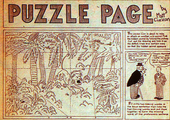
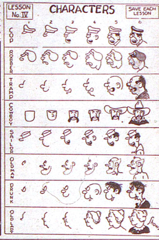
There are two activity pages. “The Puzzle Page” in black and white by Matt Curzon, his only contribution to this magazine, which I’m assuming was also designed by him. The other activity page is “The Monthly Cartoon Lesson” by Charles Shows. The lesson for More Fun #8 is how to draw heads. This would be Shows last appearance in the Major’s magazine. This feature appeared initially in New Fun #6 (October 1935).
It took a little digging to find information about Shows because he’s not listed in any of the accessible comics databases and he followed a different career than most of the other artists. From Don Yowp’s detailed post, I believe him to be Charles W. Shows born in El Paso in 1917. That means he would have been 19 years old in 1936. If that seems improbable, he was listing himself in the El Paso City Directories in 1935 and 1936 as a commercial artist. How he managed to connect with the Major is unknown. Perhaps he was related to someone the Major knew from his days in El Paso or he found one of the advertisements and applied for the work. He seems to have had an interesting career and comes across as quite the publicist, especially for himself. He has an impressive listing on the IMDb as a writer for television shows during the 1950’s and 1960’s such as “Time for Beany,” “The Huckleberry Hound Show,” “Bozo: The World’s Most Famous Clown,” “Les aventures de Tintin” and others. He worked for Walt Disney for a while and wrote a book about Disney. There are conflicting accounts of how much he did for the different shows and entities. A number of articles about him and his career can be found in the El Paso Herald-Post. Shows died in 2001 in Cathedral City, California.
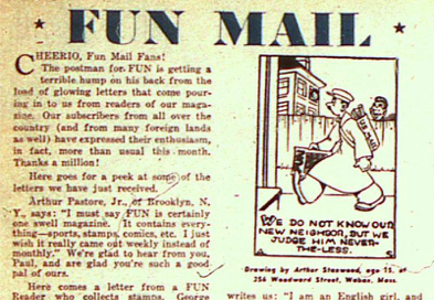
“Fun Mail” has two drawings submitted by readers and there is an ad on the opposite page encouraging readers to send in drawings and win a dollar. There are a number of letters from readers commenting on their favorite pieces in the magazine and as I’ve noted previously this is clearly the foundation for the loyal comics fan base and their ownership of the comics. There are letters from two girls revealing that girls as well as boys were reading the magazines. One fan writes from England indicating the magazines were on the newsstands there as well.
Stanley Randall has two continuing comics both in black and white with the byline Randall. “Slim Pickins” resumes the story of Slim and the gorilla who has saved him from the ghosts who turn out to be counterfeiters wanted by the police. Slim takes the gorilla to a café to feed him but the guy behind the counter isn’t thrilled by a gorilla and pies are thrown. The police are called and the last panel is of Slim sitting under a tree being fed pie by the gorilla. The story is simple and silly. The artwork is consistent with the style of the period and follows a standard newspaper format.
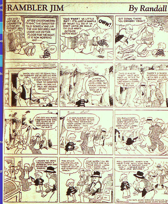
Randall’s other comic in black and white, “Rambler Jim” I find more interesting. The story is intriguing and the characters likeable. It’s also very much of the period with gangsters who have “rods.” The gangster tied up at Fishy’s shack asks young Jim for the cigarette in his pocket. When Jim gets near him, the gangster kicks Jim. Fishy comes to the rescue and smacks the gangster on the head with a log. He then sends Jim into town to tell the sheriff and gives Jim the gangster’s gun. On the way Jim hears two of the gang approaching and hides in a tree. He pulls out the gun and tells them to put their hands up, which they do. Jim climbs down and leads them into town to the sheriff whereupon he asks the sheriff how to use the gun.
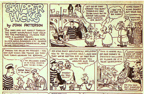
“Skipper Hicks” by John Patterson in black and white is his only contribution to the magazine. The story moves forward in some fashion with Skipper Hicks, Soupladle and Spongenose—yes, you read that right—arriving on the mysterious islands. Here they meet the two kings Okey and Dokey and discover that the island is loaded with diamonds but no sand and thus no glass. From the ridiculous names and story and the corresponding goofy drawing technique this hopefully was aimed at younger children.
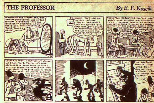
“The Professor,” a recurring comic in black and white by E.F. Koscik resumes the saga of the Professor attempting to outwit the crooks who are trying to steal his formulas. In this episode the Professor dons a monkey costume to fool the crooks. They send a real gorilla to kidnap him—why a gorilla is not clear—but the gorilla falls in love with the fake monkey/Professor. He knocks out the crooks to save his newfound love. The professor and the gorilla dialogue in a very silly made up language but again I’m trusting this was aimed for children. And what’s up with the gorillas? One of the panels showing the thieves and the gorilla creeping towards the Professor’s home with the moon behind throwing their shadows is particularly nice.
The two non-fictional comics provide histories of flight and mining in the west. Neither have a byline nor are they signed. “Thor’s Famous Flights,” in black and white is a recurring feature. This installment focuses on parachutes and dirigibles. Although it is attributed to Al Whitney, I’m curious as to why it became by “Thor.” Thor also contributed an ongoing story “Wing Walker” in New Comics and I’m not sure that Thor and Whitney are one and the same. I’ve been guessing this may have been drawn by Henry Kiefer and I’m now wondering if his wife, Aline De Kerosett may have contributed since there are often historical facts relevant to French history and it seems to be written in the same style as their contribution to New Comics, “Just Suppose.” This is one I’m going to continue to pursue.
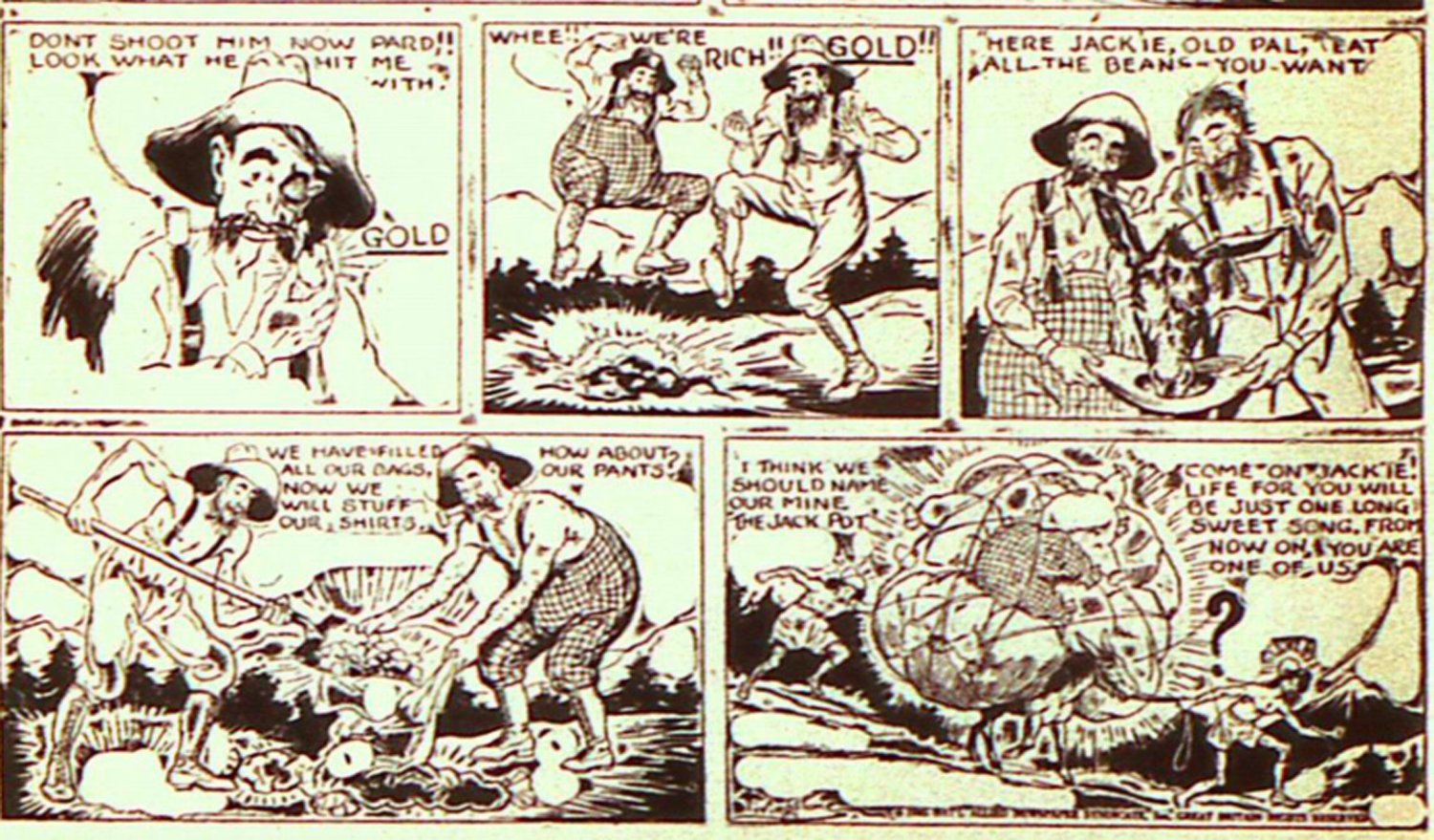
The other non-fiction comic in black and white is “A True Story of How a Mother-Lode was Discovered.” The small indistinct signature has a g in the center of the name that is similar to Livingstone’s and the artwork is also similar. It is also similar to what appears to be a signature in Ivanhoe. I checked with a collector who has an original More Fun #8 and he confirmed that Ivanhoe and this comic are both signed by Livingstone. The story is simple about two prospectors who have a mule that kicks a lot and throws up a gold nugget that turns out to be the clue to the motherlode. According to the “Quarterly Illustrator” of 1894 Livingstone spent some time in California in the Sierras so that would also lend credence to his being the artist and writer of this comic.
“Barry O’Neill,” most likely written by the Major and illustrated by Leo E. O’Mealia, is one of the two comics O’Mealia has in this magazine. Both are ongoing stories and both are derived from the Major’s pulp stories. Barry and LeGrand are paralyzed by mysterious rays. Fang Gow demands to know why they refuse to acknowledge his power. When the rays are turned off Barry throws something—unclear what—but it enables Barry and LeGrand to escape into a secret passageway after a fight with Fang Gow’s men. My sense is that this story is being created each week with some new challenge for Barry to overcome as opposed to the “Bob Merritt” comic, which follows the original pulp. If you consider the way comics developed this is one of the foundations of continuing stories in comics having a succinct story within a continuing story and the last panel being the proverbial cliffhanger.
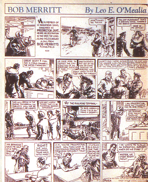
“Bob Merritt,” in black and white by Leo E. O’Mealia from the Major’s pulp story “Hawks of the Golden Crater,” is beautifully illustrated by O’Mealia and the story is concise and clear since it follows the pulp plot line closely. Pulp stories translate easily into comic format. The story continues with the fake prospector appearing after the mysterious death of the investor. O’Mealia’s illustrative artwork looks great in this black and white format that is mostly interior shots of characters. As the story progresses in later magazines his artwork opens up along with the story in which much of the action takes place in the air.
“Magic Crystal of History” in black and white by Ray Wardel (Wardell) continues the story of Bobby and Binks who have been transported to ancient Egypt and find themselves in the midst of a coup attempt. The comic was originally written and drawn by Adolphe Barreaux beginning in New Fun #1 and then by Monroe Eisenberg in New Fun #4 and #5 with Ray Wardell taking over in New Fun #6, More Fun #7 and More Fun #8. I don’t find Wardell’s artwork as fine as Barreaux’s and Eisenberg’s. The story seems somewhat disjointed at this point as well. Given that it was executed by more than one artist, my guess is this is another of the Major’s ideas given to artists to work from, especially as MWN’s contracts were basic pulp contracts with North American serial rights meaning the rights reverted to the creator after being published. It’s pretty easy to tell which ones were his ideas by noting the comics that changed artists and the comics that were discontinued when a creator no longer contributed to the magazine.
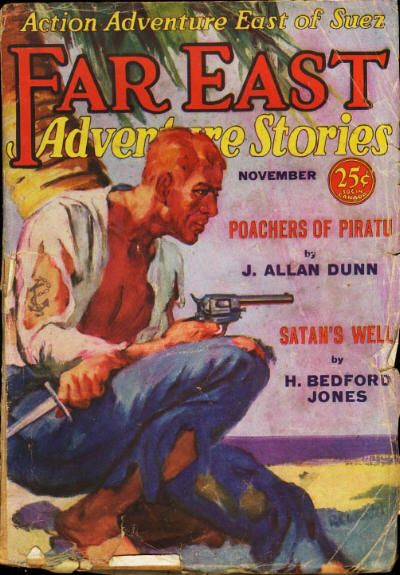
This would be Wardell’s last contribution to the Major’s magazines. Raymond Wesley Wardell was born in Brooklyn in 1886 and was one of the older artists contributing to the magazine. He was an established commercial artist. Wardell was also a cover artist and illustrator for a number of pulp magazines including Far East Adventure Stories in 1931, which the Major wrote for as well. This is most likely the connection. He is also purported to have been connected with Adolphe Barreaux’s comic shop during that period. One of the intriguing bits of information according to David Saunders is that Wardell became president of “the American Artists Equity, an organization that lobbied the National Recovery Administration (NRA) to reduce artist exploitation.” His wife Sarah Jackson Wardell may have also written for the pulps as there is a Sara J Wardel who wrote pulp stories in the 1920’s and 1930’s. Wardell apparently had a successful career in commercial art, later became a retouch artist and wrote—Short Cuts to Photo Retouching, 1947. He died in Los Angeles, CA in 1966.
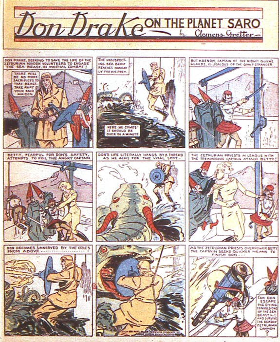
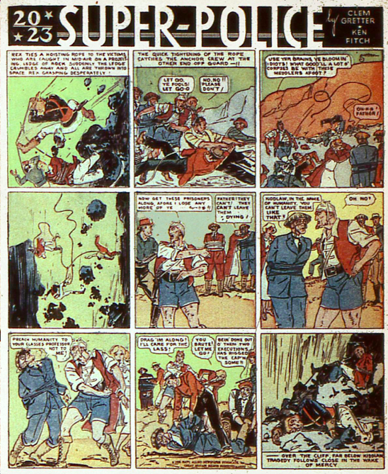
Steampunk enthusiasts should take a look at the continuing series “Don Drake on the Planet Saro” by Clemens Gretter and “2023 Super-Police” by Gretter and Ken Fitch. Both series began in New Fun #1. Originally Don Drake had both Gretter and Fitch bylines so perhaps Gretter is now writing Don Drake as well as illustrating. At first, I found both stories ridiculous but as I’ve followed the stories, I’ve concluded they are meant to be somewhat tongue in cheek and with that in mind I’m enjoying them more. Gretter’s artwork has an illustrative look but it’s not overly done and has enough white space so you can see what’s going on. Both stories look great in color in More Fun #8.
Don Drake’s costume is steampunk all the way and the costumes of the Zetrurians are in a category all their own. Don attempts to stop the sacrifice of Zetrurian maidens by attacking the sea beast that is preying upon the Zetrurians. Meanwhile the Priests and the Captain of the Queen’s Guards grab Betty and sabotage Don’s attempt to kill the sea beast.
The costumes in “2023 Super-Police” are also over the top. Our hero, Rex is dressed in some sort of military uniform in bright blue with red. The professor in a business suit, has a bizarre sort of Chinese straw hat and the evil Captain Kiddlaw is in shorts with very hairy legs. The story continues with Rex and several men falling over the cliff. Kiddlaw seemingly allows them to go to their death. They leave Rex to his supposed death at the bottom of a cliff and continue to take the Professor and his daughter as prisoners. Somewhere in all this there no longer seems to be a problem breathing the atmosphere. I’m not sure how that got resolved.
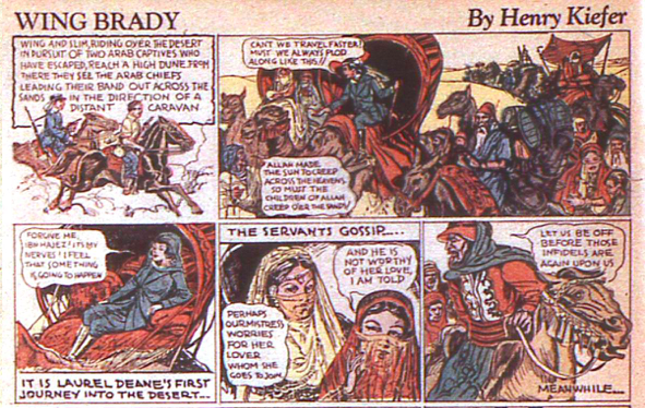
Henry Kiefer had one story in More Fun #8, his continuing saga of “Wing Brady” in color. Wing and Slim on horseback chase the escaped Arabs across the desert. At the top of a high dune they see the Arab band heading towards a slow-moving caravan. There are close-ups of the caravan, in which, a young European woman is traveling to meet her “fiancé.” Wing and Slim head towards the caravan but they are too late to stop the inevitable. The artwork is in the illustrative style but very active and the story is pulp style. There are aspects of “Wing Brady” and “Wing Walker” from New Comics that are similar. That’s one of the reasons I’m wondering whether “Thor” is possibly Kiefer.
Walt Kelly is now using the byline Walt Kelly instead of Walter C. Kelly. He has one feature in color, “The Little People Irish Tales.” It’s done in the style of classic comics with the prose at the bottom of the panel. Although it follows the format of the classic story, the art work is not overly illustrative but a nice combination of illustration and cartoon style. This is Kelly’s last contribution to the Major’s magazines.
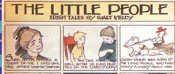
There are numerous resources for Kelly’s life and work who is most known for his “Pogo” strip. Kelly was born in 1913 and was of Irish-American descent. As far as I can tell his first comics were for the Major. He would have been only about 22 at the time. According to one online source Kelly began working for Walt Disney studios as an animator in January 1936. I couldn’t find an independent confirmation but if that is accurate, then it is certain that his first work in comics was for the Major. I have noted previously that his initial byline was Walter C. Kelly and then eventually it became Walt Kelly. After working in animation at Disney, Kelly drew comics for Dell and Disney. The first Pogo strip appeared in The New York Star on October 4, 1948. It was immensely popular. As a child, it was my favorite of all the Sunday strips. Kelly continued Pogo until his death in 1973. One good source for more information, although some of their dates are slightly different, is Lambiek Comiclopedia.
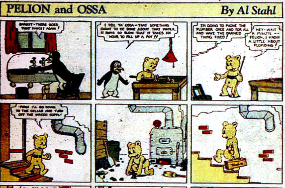
“Pelion and Ossa,” the continuing characters from New Fun #1 were written and drawn by Al Stahl in New Fun #6, More Fun #7 and now More Fun #8. This episode in color isn’t all that interesting. Ossa repairs the plumbing but mixes up the hot and cold water. The artwork is solid and appealing.
If you’ve made it to the end of this article, I salute you. Here are the good people and sites from which I purloined: David Saunders, Carol Tilley, Don Yowp, Comics Books Plus, The Fiction Mags, Grand Comics Database, and Lambiek Comiclopedia. MWN Group contributing to this article—Bob Beerbohm, Ray Bottorff, Jr., Bob Hughes, Doc DC, Jim Davidson, Lionel English, Patrick Ford, and Barry Pearl among the other superguys. All mistakes and errors are mine. They do their best to keep me on the straight and narrow.
Next up: New Comics #3 all 64 pages!