For Super Sleuth DC Fans: An ongoing look at 86 years of DC Comics, beginning with New Fun #1, January 11, 1935 through March 1938.
Contributor mini bio: Adolphe Barreaux
DC Comics dates its history from January 1935 with New Fun #1. Major Malcolm Wheeler-Nicholson’s foray into comic book publishing in the midst of the Depression continued into 1936 with More Fun #7 arriving on newsstands December 13, 1935 with a January 1936 cover date. More Fun #7 lives up to its name since most of the comics included are serial stories and character comics from New Fun #1-6.
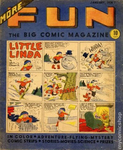
Why More Fun #7 instead of New Fun #7? The changes in the indicia and statement of ownership indicate the name change is likely for reasons of ownership or investors. The masthead is the same as New Comics #1, published a month earlier. Malcolm Wheeler-Nicholson is listed as Editor and Publisher; William H. Cook, Managing Editor; Vincent A. Sullivan, Assistant Editor; and John F. Mahon, Business Manager.
The statement of ownership, if I am reading it correctly, indicates that Malcolm Wheeler-Nicholson and the Brooklyn Daily Eagle are the owners of More Fun Magazine, Inc. It is signed F. B. Jeske, Asst. Business Mgr. “of the More Fun Magazine.” Jeske’s address is given as 420 Desoto Ave. St. Louis, Mo. the same address listed as the publishing location for More Fun. It is also the address of World Color Printing. From my rudimentary understanding of distribution and printing during this era, the printer was often initially paid by the distributor thus lending the publisher upfront money to pay the printer. The publisher could wait months before he would get a final accounting and receive his share of profits from the magazines sold–if there was any profit. World Color was insuring that at least they were going to be paid.
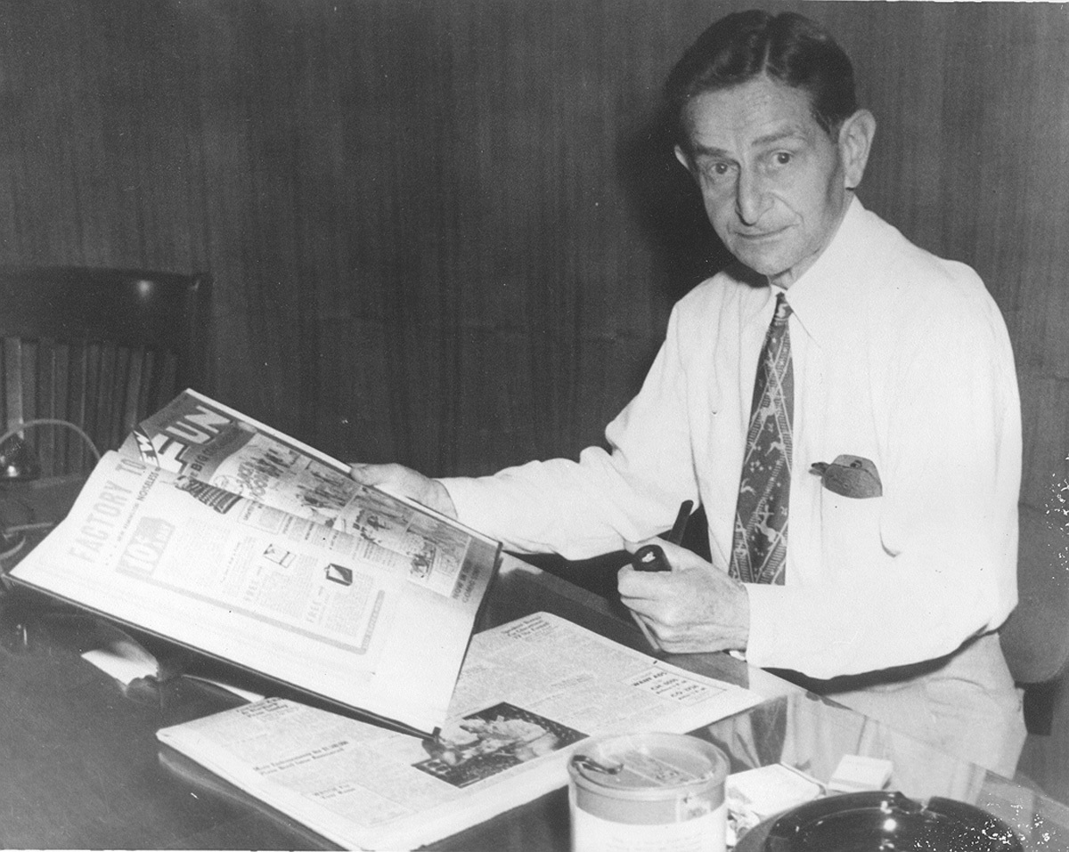
R. Messing of World Color holding New Fun c. 1940. Thanks to J.L. Mast
In this system a publisher would need to be confident of the distributor’s accounting because the distributor held all the cards. The Major did not have full financial control of his business from the very beginning. He was dependent on the distributor—in this instance—S-M Newspaper Distribution Company and they in turn were dependent on the various regional wholesalers to report accurate figures from the local retailers. MWN was also dependent on the printer—World Color—for accurate accounting of the number of magazines printed. If that’s not a recipe for skimming off the top all down the line, I don’t know what is. Remember this is the Depression and people need money. With such a small operation, how could MWN know for sure, if the figures reported to him were accurate? In addition, again from my basic understanding of the percentages, the publisher would often end up with as little as 10%. That’s about a penny a magazine. You have to sell a lot of magazines to make any money much less keep your shop going.
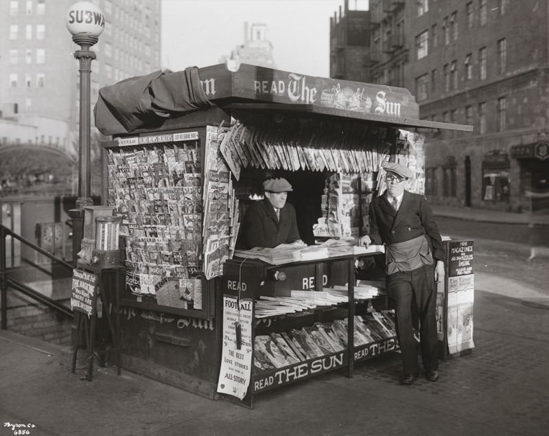
NY city newsstand c. 1933
It was an audacious attempt to publish all original comics during one of the worst economic periods in our history. The Major persevered as Lloyd Jacquet stated in 1957 in Newsdealer Magazine. “But Major Nicholson’s quiet determination and resourcefulness in the face of many odds and situations pushed the whole thing along until his progress started to be known by others. Then the real fun began—but that’s another story!” Everyone who came after the Major—Donenfeld, Liebowitz, DC Comics, Warner Brothers and now ATT including all their board members and their corporate shareholders owe a very great deal for their fortunes to the vision and perseverance of my grandfather. Who else had the vision to create this business? The only other person I can think of, is Max Gaines and his story needs to be told as well.
![]()
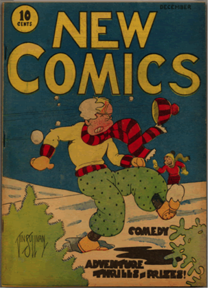
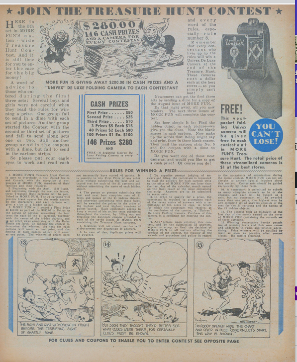
The other source of income is ad revenue and subscriptions. There aren’t many ads in More Fun #7. The Pastime Company—in the same building, 373 Fourth Avenue—has a ¼ and a ½ page ad on the inside cover and Remington has the back cover with a typewriter ad. Those would be fairly expensive spots. The House of Magic has a single 1/2 column ad on the “More Fun and Magic” page. Universal Toy & Novelty Mfg. Co. has a tie-in promotional ad that is a ¼ single column. The ongoing promotional contest “Join The Treasure Hunt” occupies a full page. Besides two smaller ads in the interior for More Fun and New Comics the inside back cover has a full-page ad in color for New Comics.
The business aspect of comics is the container. Without the artists and writers there is no content and without content that interested readers, MWN’s comics magazines would not have lasted like so many other “firsts.” Obviously, readers liked the content of New Fun and the fan mail proved it even if there were no immediate figures to confirm the sales. I doubt that World Color or S-M Distributing would have risked advancing funds if they didn’t see a return especially during difficult economic times.
Why two different magazines—More Fun and New Comics? Why not simply one? The Major based his business strategy on what he knew—pulp magazine publishing. To make money, it was necessary to sell a lot of magazines at 10c in order to pay the whopping printer costs among other items. As Laurie Powers noted in Queen of the Pulps, Street & Smith pulp magazine publishers had their printing in-house enabling them to control that part of the financial equation. All the successful pulp magazine publishers had numerous magazine titles and that is what the Major intended from the start. What they also had that helped in their success were business ties to distributors in one way or the other. And as Jacquet notes that’s a whole other story.
Going through the magazines chronologically reveals the emergence of genres and dedicated content that is heading in the direction of comics as we know them. From what I’ve read to this point, More Fun is following the template laid out in New Fun #1 and is referred to as “The National Comics Magazine.” Most of the comics included are more illustrative than those in New Comics. New Comics has twice as many comics, not as much prose material and new emerging artists. The comic style is more cartoony lending itself better to the color process of that period. Too much detail can often end up with a muddied look. New Comics is referred to as “the International Picture Story Magazine.” The Major pursued international distribution as he noted in the 1938 forced bankruptcy proceedings but it’s not yet clear precisely why there are those two designations.
So what was in More Fun #7?
The magazine was no longer tabloid size however, like New Funs 1-6, it featured a comic on the deep blue cover—”Little Linda,” a recurring character created by Whitney Ellsworth. Her ongoing saga as an orphan facing the obstacles of the Depression continues in a story by Ellsworth inside the magazine. The cover is a stand-alone story.
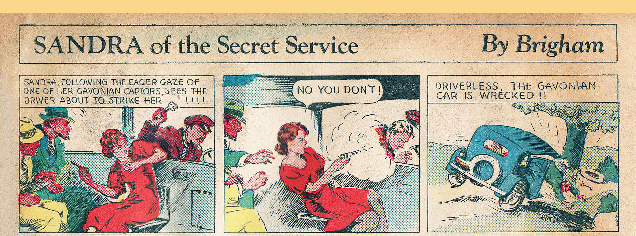
Once again, “Sandra of the Secret Service” leads off in color with artwork by William Clarence Brigham, Jr. Sandra has been kidnapped but has managed to wrestle a gun from the kidnappers and trains it on them in the first panel. She notices one of the men looking behind her and catches the chauffeur attempting to attack her from behind. Sandra shoots the chauffeur and the car is wrecked. She escapes unharmed and reaches Lothar and Reynolds as they are being attacked by “Gavonian enemies.” Our heroine saves them by shooting one of the guards. As Sandra is being thanked by Lothar and Reynolds, she replies, “Nonsense! But say—let’s hide this body and skip!” And who among us has not wanted to hide a body and skip?
Brigham also continued drawing and possibly writing “Brad Hardy” originally drawn by Richard Loederer and the comic “Jack Woods” originally drawn by Lyman Matthew Anderson. “Brad Hardy” has a number of elements from pulp stories of the Major’s that take place in Tibet and Mongolia. MWN either came up with an outline and left it to the artists to flesh out the story or they pulled the story from the various pulp magazines that were available in the office as Jacquet noted. The Brad Hardy story seems far-fetched and all over the place and Brigham’s heart doesn’t seem to be in it. He’s much better with Sandra and “Jack Woods.”
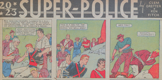
Clemens Gretter and Ken L. Fitch continued their two space/futuristic odysseys—”Don Drake on the Planet Saro” and “2023 Super Police” both in color. It’s hard to tell if Gretter and Fitch were sincere in their vision for Don Drake and Super Police because there is an element of satire in the storylines and in the artwork. Given Fitch’s ability to write solid stories, the more of the series I read I can’t help but consider they are deliberately somewhat tongue in cheek. They’re fun to read if seen in that light and nicely drawn by Gretter.
Another comic which comes across as satirical is John Patterson’s “Skipper Hicks” in black and white. The artwork exaggerates the characters and there is an obvious political reference in the first panel with an elephant’s mounted head.
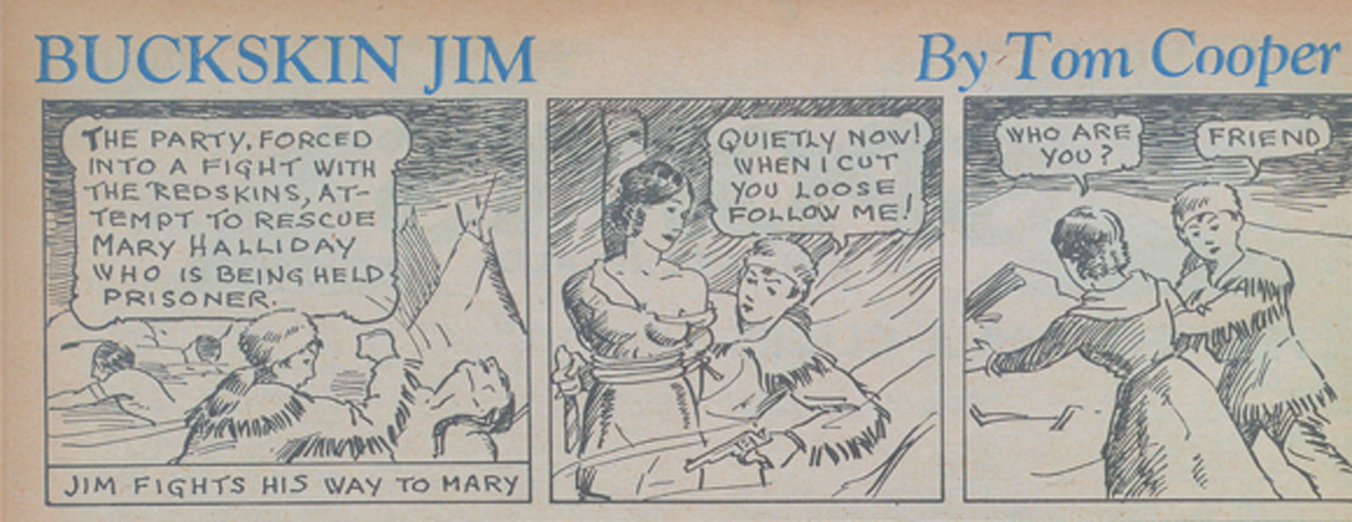
Tom Cooper as MacFergus continued his comic “In The Wake of the Wander” in color. This particular episode is also similar to one of MWN’s pulp stories—“Spanish Doubloons.” Cooper, under his own name, continued his “Buckskin Jim” frontier adventure story in black and white. When Jim finds Mary tied up by the “Indians,” her dress has slipped off her shoulder and cleavage is revealed. It’s the first time I noticed anything remotely sexual in these comics. Cooper also contributed “Along the Main Line” in black and white, with continuing characters who face different adventures on the railroad. He had more features than anyone with the fourth, “Midshipman Dewey,” in color originally drawn by Adolphe Barreaux and then Richard Loederer.
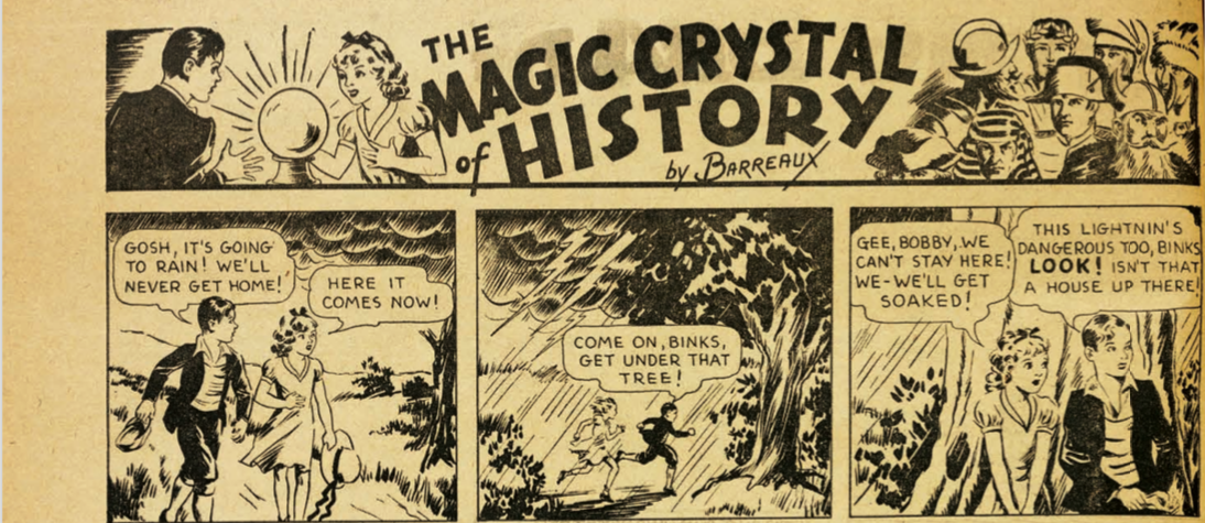
Adolphe Barreaux appeared in New Funs 1-3 with “The Magic Crystal of History” which in this issue is drawn by Ray Wardell. He also wrote and illustrated “Fun Films” and “Midshipman Dewey.” Barreaux has quite a backstory. I noted in his bio in the “DC Famous First Edition” reprint of New Fun #1 that Barreaux was of African-American heritage making him the first black artist in the very first DC title. However, Barreaux hid that background and passed himself off as white. That makes it difficult to promote him as the first black artist for DC since he, himself did not admit to it publicly. I debated about drawing attention to his story last year after the reprint appeared in April 2020 but decided against it. I know what it is like to have people muck around in your family’s history.
The first time I came across Barreaux in relationship to MWN’s comics I thought—there’s a story here. His name spoke to me of someone with a dramatic flair possibly using a nom de plume. In fact, he was born Adolphus B. (Barreaux) Grippon. I imagined Barreaux to be sophisticated and witty like a character from a Noel Coward play and, I think that initial impression may be close to the truth. Born in Charleston during Jim Crow in 1899, Barreaux moved to New York as a teenager living with an aunt and attending Dewitt Clinton High School. According to a 2011 article in the Charleston Post and Courier about 40 per cent of enslaved Africans entered the US through the port of Charleston. Barreaux was admitted to the Yale University School of Fine Arts and attended for three years. Subsequently he returned to New York and opened his first studio in 1924 and began a successful career in advertising and as an illustrator for magazines. This would have been difficult to achieve in that period of time as a black man.
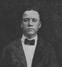
From David Saunders “Pulp Artists.”
According to Men of Tomorrow Barreaux founded Barreaux Studios with Harry Donenfeld. That Barreaux managed to maintain a business relationship with Donenfeld for about 30 years or more without being financially destroyed like my grandfather speaks to his nimble intelligence. It may be a result of his subterfuge since he had no choice but to be twice as aware and clever than most others involved in the nascent comics industry. And there is also the possibility that Donenfeld was aware of his background, which may have affected their relationship.
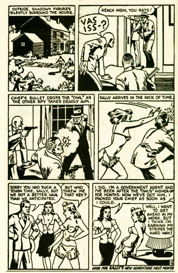
Barreaux’s “Sally the Sleuth” comic, appearing in 1934 in Donenfeld’s pulp Spicy Detective Stories, along with everything else “spicy” was meant as an enticement. However, Sally was pretty gutsy. She always got her man even if she was in her underwear. Barreux’s artwork, open and fluid with strong lines, is distinctive like so many of the early artists as there was no “corporate” style.
Years later, I found information on Barreaux, on David Saunders’ website of pulp artists. There was an early photo of Barreaux. David’s information indicated that he was of mixed-race heritage. I hadn’t seen that information anywhere else and saved the link for future reference. I never saw the information anywhere after that and there was no mention of it in the greater comics history community.
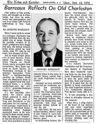
Two years ago, while researching the bios for the DC reprint of New Fun #1, I went back to Saunders’ website and although the photo was still there the reference to Barreaux’s racial ancestry was not. I thought maybe I had imagined it. I contacted David and he told me the story of his research into Barreaux’s life and the family’s reaction when he approached them with his information. The older generation was apparently upset by the knowledge, however, the younger generation seemed fine with it. In deference to the family, David removed that specific information from his site. He sent me copies of his original research, which allowed me to corroborate the information. I also corresponded with a member of Barreaux’s extended family who was doing research on the family and she gave me some information as well. I asked David if I should include this information in Barreaux’s bio for New Fun #1 and he told me that I should tell the truth. That is what I did and it is in the New Fun reprint published in April 2020. It must have been satisfying for Barreaux to be treated respectfully in 1973 by a hometown newspaper, The Charleston News and Courier. Barreaux is another of the significant figures in the founding of the comics industry who should be more widely known.
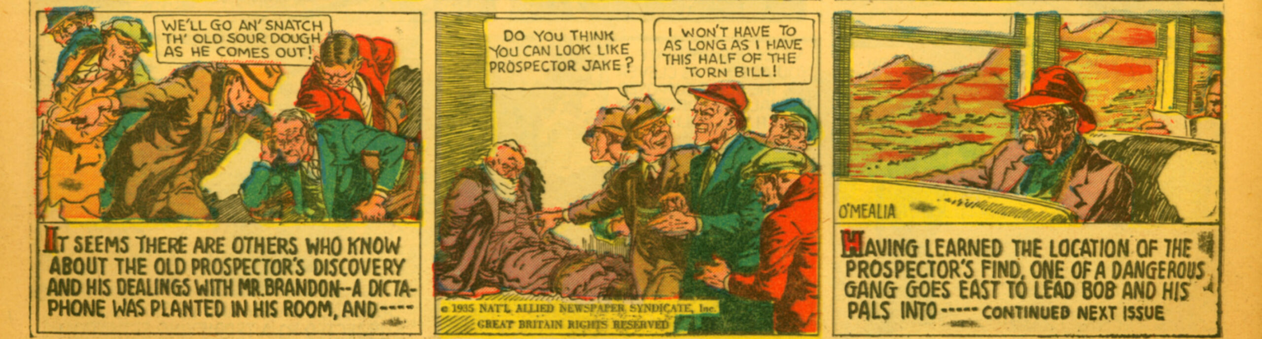
DC’s first action hero—Barry O’Neill—drawn by Leo O’Mealia from pulp characters and similar plot lines from an MWN pulp story “The House of Fang Gow” continued in More Fun #7. O’Neill and Inspector Legrand are captured by Fang Gow and bombarded with mysterious rays. There are mysterious rays in a number of the stories in this magazine that render the hero unable to be heroic. Sound familiar?
Leo O’Mealia’s artwork shines in the “Bob Merritt” continuing story. Another comic derived from the Major’s pulp stories, “Hawks of the Golden Crater” follows the original closely. It has a stronger storyline than “Barry O’Neill” most likely due to the original through line of the pulp.
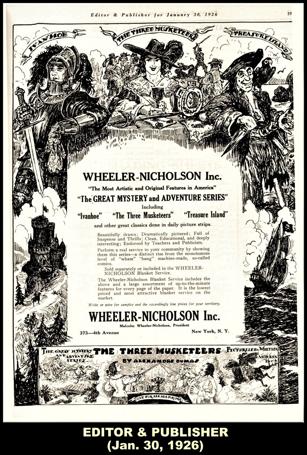
The classic Sir Walter Scott novel Ivanhoe continues in color. It was also one of “The Great Mystery and Adventure Series” that MWN published through his newspaper syndicate in 1925-1927. The story is at the bottom of each panel and more than likely MWN wrote the outline of the script. Although it is unsigned the artist is considered to be Raymond Perry. It was originally drawn by Charles Flanders. (see Todd Klein’s post on Perry)
Charles Flanders appears in More Fun #7 as the artist for “Treasure Island.” This was also one of the original Great Adventure Series from the 1925-27 MWN syndicate. It’s done in the same classic style with the story at the bottom of each panel. Flanders’ artwork fits well with classic stories. MWN probably wrote the script. I looked at the signature carefully and it is CF ‘34. That indicates to me that Flanders probably submitted this early on and was no longer actively part of the production of the magazine.
The somewhat odd Famous Flights by “Thor” in color is an ongoing word and picture history of the story of flight. For reasons I’ll discuss in the next post on New Comics #2, I think it may have been written and drawn by Henry Carl Kiefer. For one, Kiefer’s continuing story “Wing Brady” in black and white has, as the main character, a hero who is adept at flying planes, often used to move the plot. The artwork also seems similar.
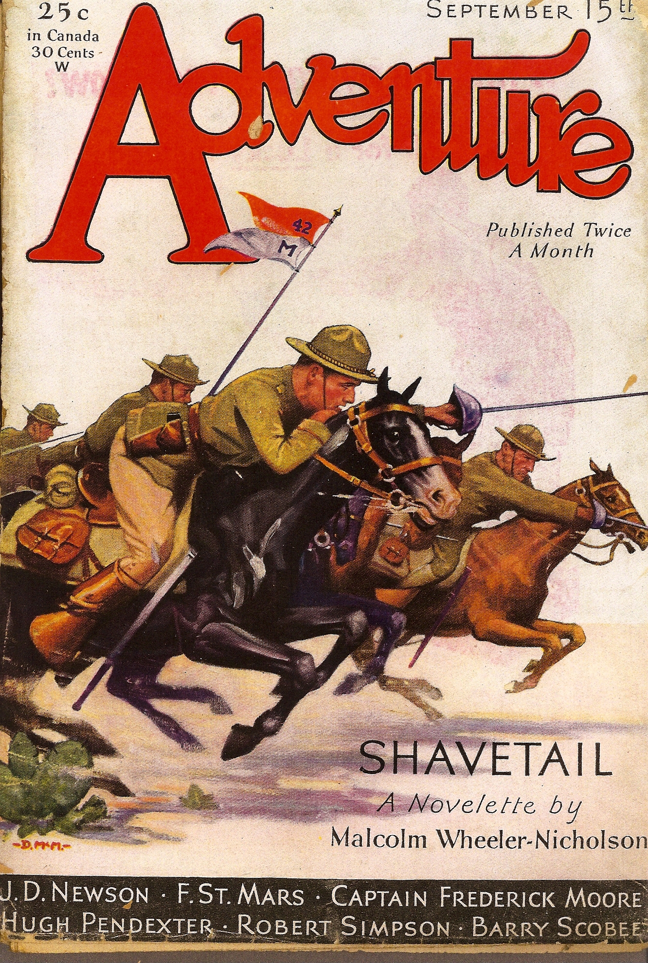
The Major’s pulp adventure story “Shavetail” is concluded in More Fun #7. Told from an observer’s point of view, it’s one of his best and takes place on the Texas/Mexico Border. John Locke and I included it in The Texas-Siberia Trail.
The articles from New Fun continue with “Movies,” “Radio,” “Stamps and Coins, and “Books, Books.” Dick Loederer’s logos for “Stamps and Coins” and “Books, Books” are still in use. In the “Stamps and Coins” article there is, from the hindsight of history, a rather casual discussion of a new “Nazi” stamp that has been released. I find most of the non-fiction pieces tough to get through. They must have been popular at the time as they continued to be published in the magazines.
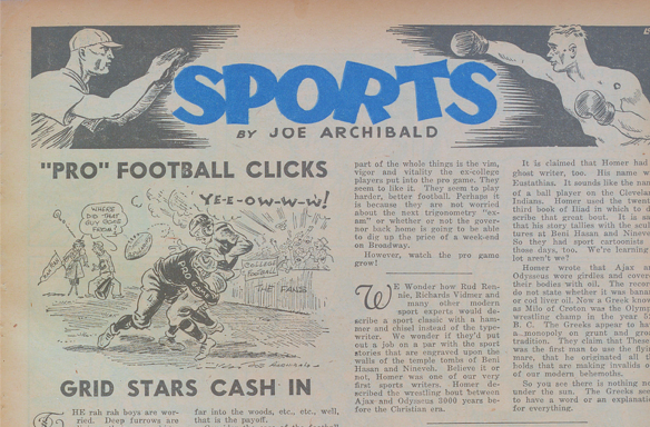
Joe Archibald’s “Sports” articles with his illustrations are more interesting. His articles reflect various aspects of culture in this era through the discussion of sports and are well-written. In More Fun #7 he discusses the nascent professional football league as opposed to the dominant college football scene.
In addition to the articles there are several activity pages—”More Fun and Magic by the Wizard of Biff” with the illustration originated by Loederer and a “Puzzle Page” by Matt Curzon.
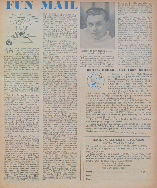
The “Fun Mail” section with Loederer’s logo provides a window into what the fans liked and wanted. From the letters that are excerpted girls are reading the comics as much as boys. A reader writes in, “I am a girl twelve years of age and I bought my first copy of FUN in August.” A “Fun Club” member writes to ask how to connect with other Fun Club members in his neighborhood. Fans were wanting to meet one another from the very beginning. Comic Con is on the horizon.
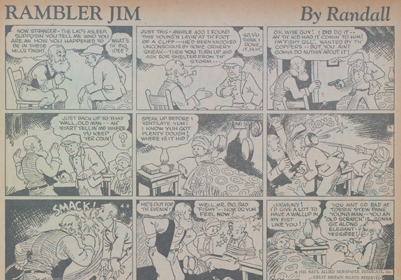
There are a number of cartoons obviously aimed for a younger audience like Stanley Randall’s “Slim Pickins” which follows the adventures of Slim who inherits his aunt’s haunted house. His “Rambler Jim,” entitled “Ramblin Jim” previously, features an older character that is more intriguing. He is somewhat mysterious and we want to know more about him. Both are in black and white. Randall’s artwork in “Rambler Jim” is particularly fine in its details.
“The Professor” by E. F. Koscik in black and white, has a goofy story line and the artwork supports that. The crooks attempting to steal the professor’s formula speak in a form of Yiddish and there is a lot of slang from the period, which is interesting but dated. I sincerely hope that Koscik was Jewish otherwise we have one more example of stereotyping.
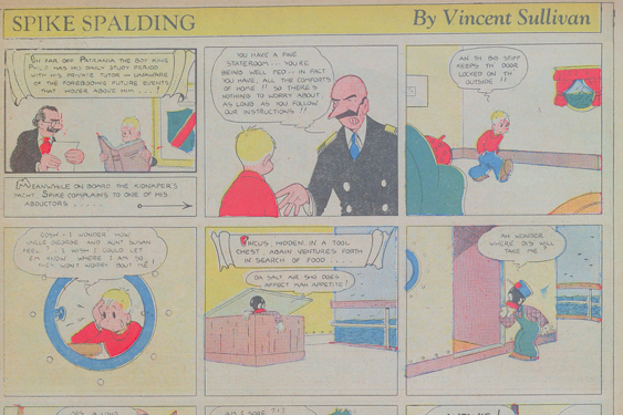
Although Vincent Sullivan’s “Spike Spaulding” (in color) is well-drawn and has a fun story line, one of the two main characters, Pincus, who is black, is cringingly stereotyped in appearance and language. The same racial stereotyping occurs in Sullivan’s “Charley Fish” story. It’s too bad because the comic is well drawn and lends itself well to the color process. Sullivan’s stories are always clear and concise whether they are episodic or continuing characters with one joke per episode.
“Junior Funsters,” “a page for a winter’s day and the little folks” has another Connie Naar story, “The Hungry Elf” and a poem “The Young Cook” with her illustrations in black and white.
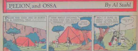
“Oswald the Rabbit“ in black and white and “Pelion and Ossa” in color return for new adventures written and drawn by Al Stahl. Stahl, at an early age, has a strong professional hand in his artwork, which is nicely detailed, and in his stories. Pelion and Ossa are clearly different in character and the story moves along to the “joke.” Stahl was only about 19 when he was drawing these comics.
Walter C. Kelly appeared again with a full page in black and white bordered in red “Down by the Old Mill Stream signed “Walt” Kelly. I don’t know when he began to use Walt Kelly but this is probably one of the first. There’s a hint of “Pogo” in the anthropomorphic characters and elves.
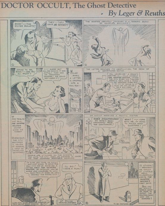
Siegel and Shuster continued their comic “Henri Duval.” The story is a little hard to follow but full of action with lots of swordplay. The storyline in “Doctor Occult” by “Leger and Reuths” is more interesting–an evil master vampire has taken over the city–and the characters are more realized especially Dr. Occult. We want to know what happens next. Shuster’s artwork is simply divine. Both are in black and white.
These short paragraphs cannot do full justice to the comics and their creators. Throughout these posts on the Major’s comics I am including some details of the life and work of every person who contributed to MWN’s comics. My grandfather stated his commitment to the creators in the forced bankruptcy case and I honor that commitment. On to New Comics #2. As Stanley Randall concludes “Slim Pickins”—“Next Issue—Thrills and More Thrills!! Don’t Miss it!”
Special thanks to: Robert Beerbohm, Mike DeLisa, Alex Jay, Todd Klein, Lambiek Comicopledia, John Locke, J.L. Mast, Laurie Powers, David Saunders and Tim Stroup.